Project Notes 02
Swirski UI
Created a reusable UI package that keeps components and visual patterns consistent across my web projects.
- Role
- Designer / Developer
- Type
- Shared UI Package
- Focus
- Design Systems
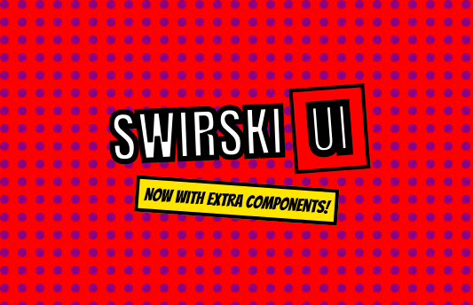
Project Overview
The problem, the constraint and what shipped.
Context
Swirski UI is the shared component package behind Swirski Dev and Swirski Studio. It collects the visual primitives and interface patterns I repeatedly need across projects.
Challenge
Keep a recognisable design language consistent across separate applications without copying components, styles and interaction decisions between codebases.
Result
Created a reusable TypeScript package and component workflow that now supports two distinct live sites while keeping their foundations aligned.
My Contribution
A self-directed build, covering the decisions from problem definition through to a useful working system.
- 01
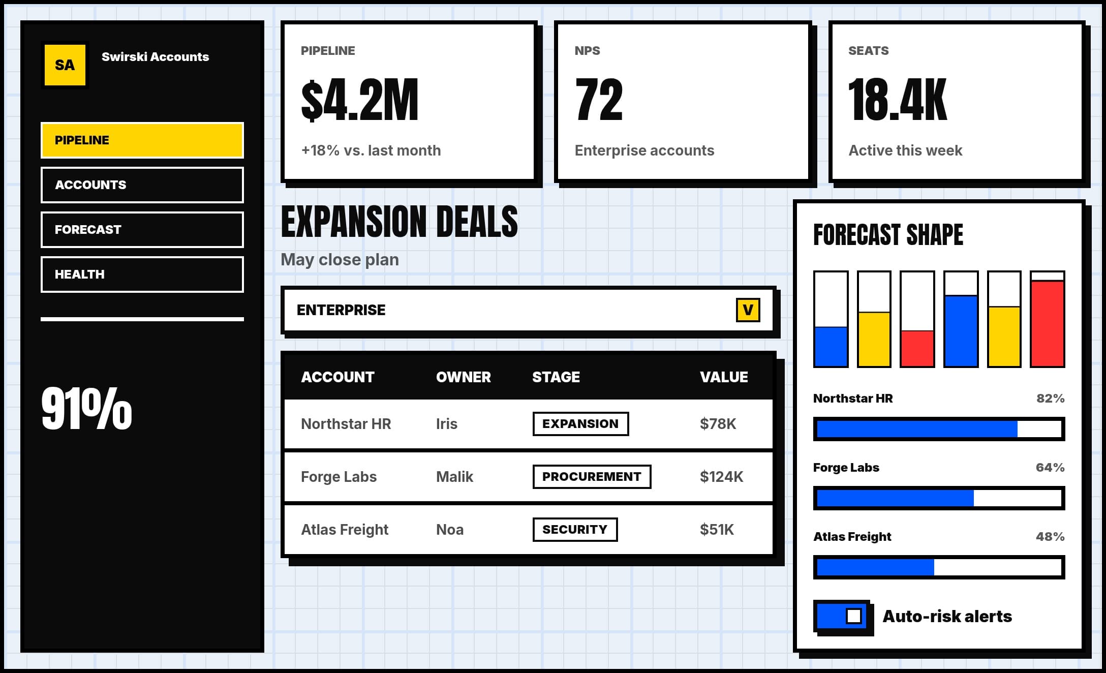
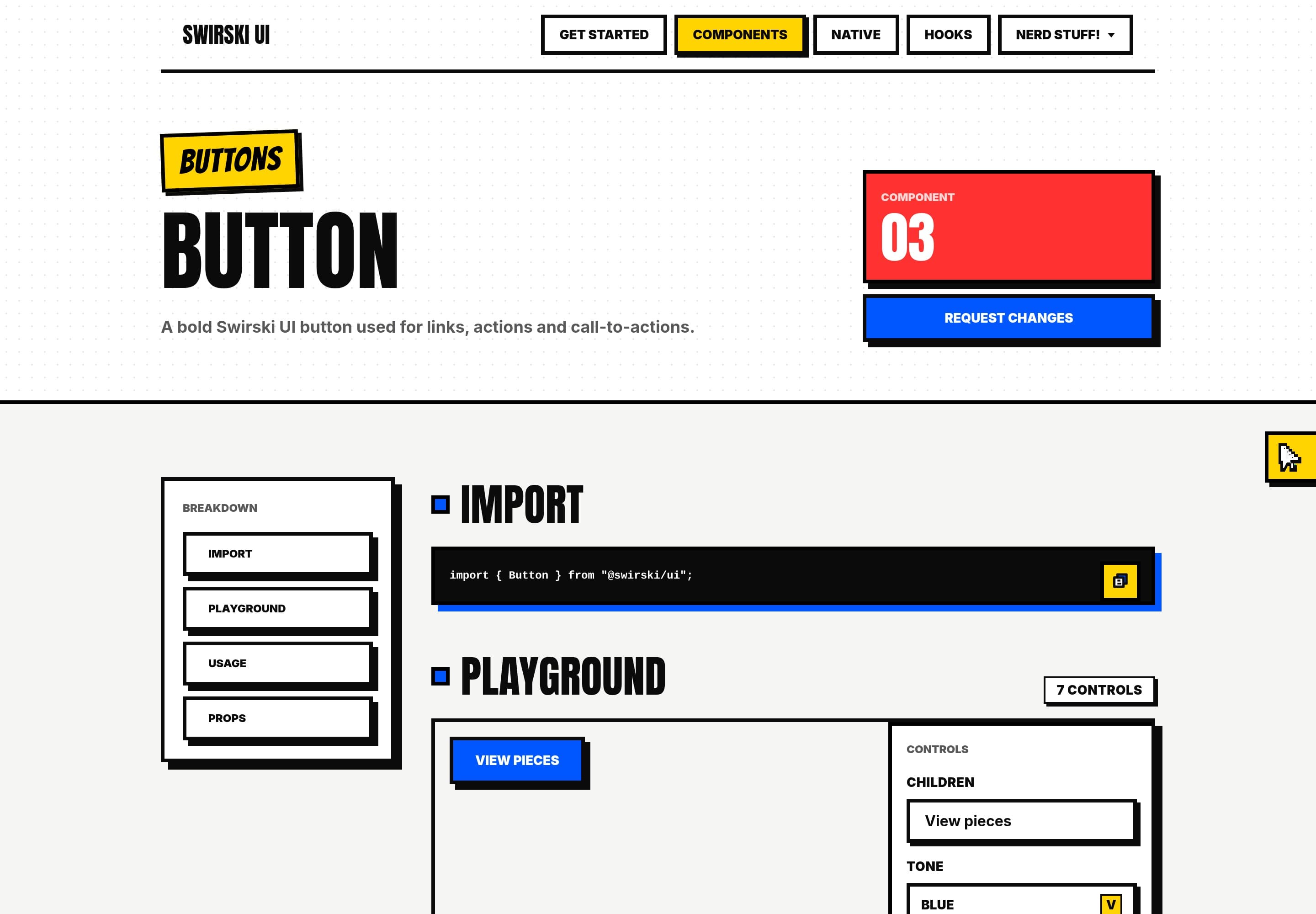
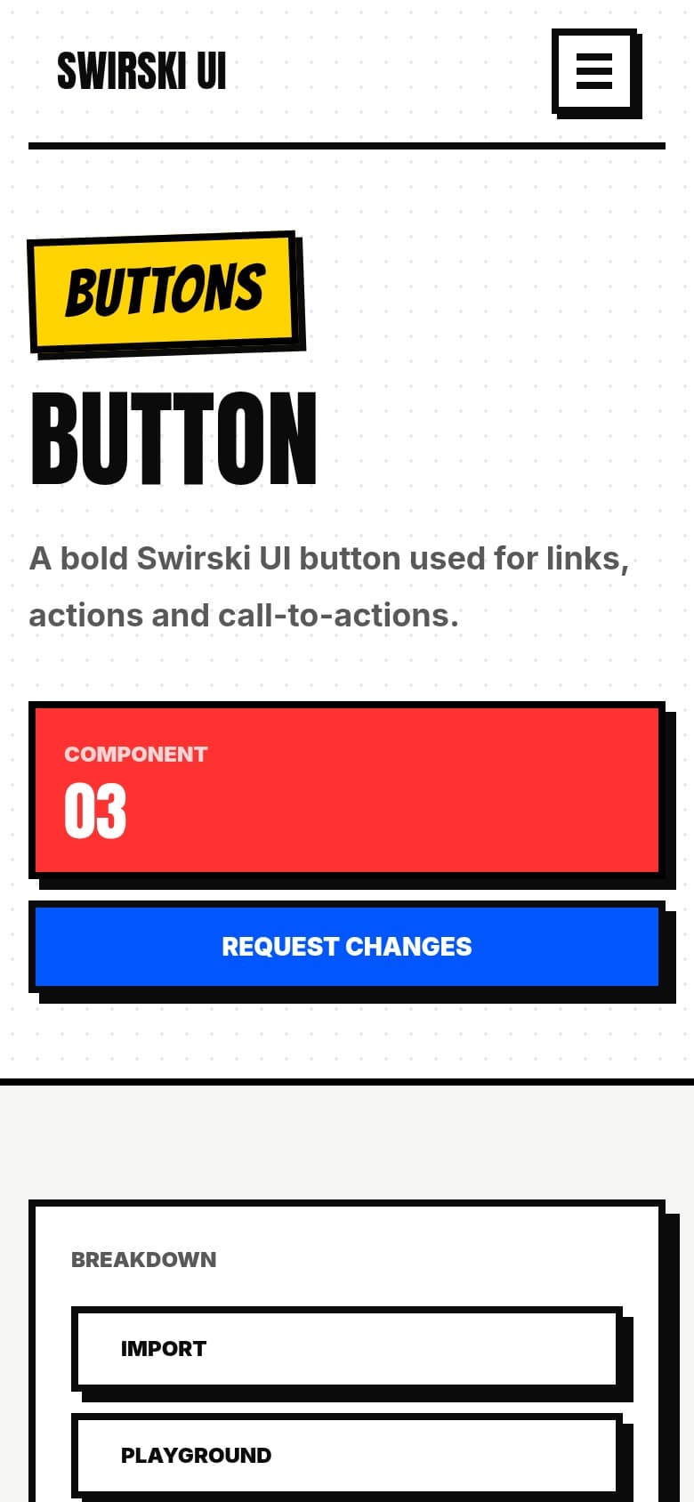
Created a personal UI package for reusable cards, layout components, media blocks, buttons, and visual primitives.
- 02
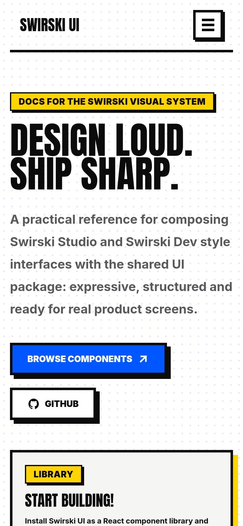
Used the package across Swirski Studio and Swirski Dev to keep the design system consistent.
- 03
Explored package publishing, versioning, and component-driven development workflows.
Components in Use
Selected visual evidence from the project.
NEXT PROJECT